Competitor Research
We went looking for elevator companies and any other business that used an elevator theme in their logo. The up/down arrows were quite a common trope, and as expected results ran from professionally-done to things likely made in MS Word.

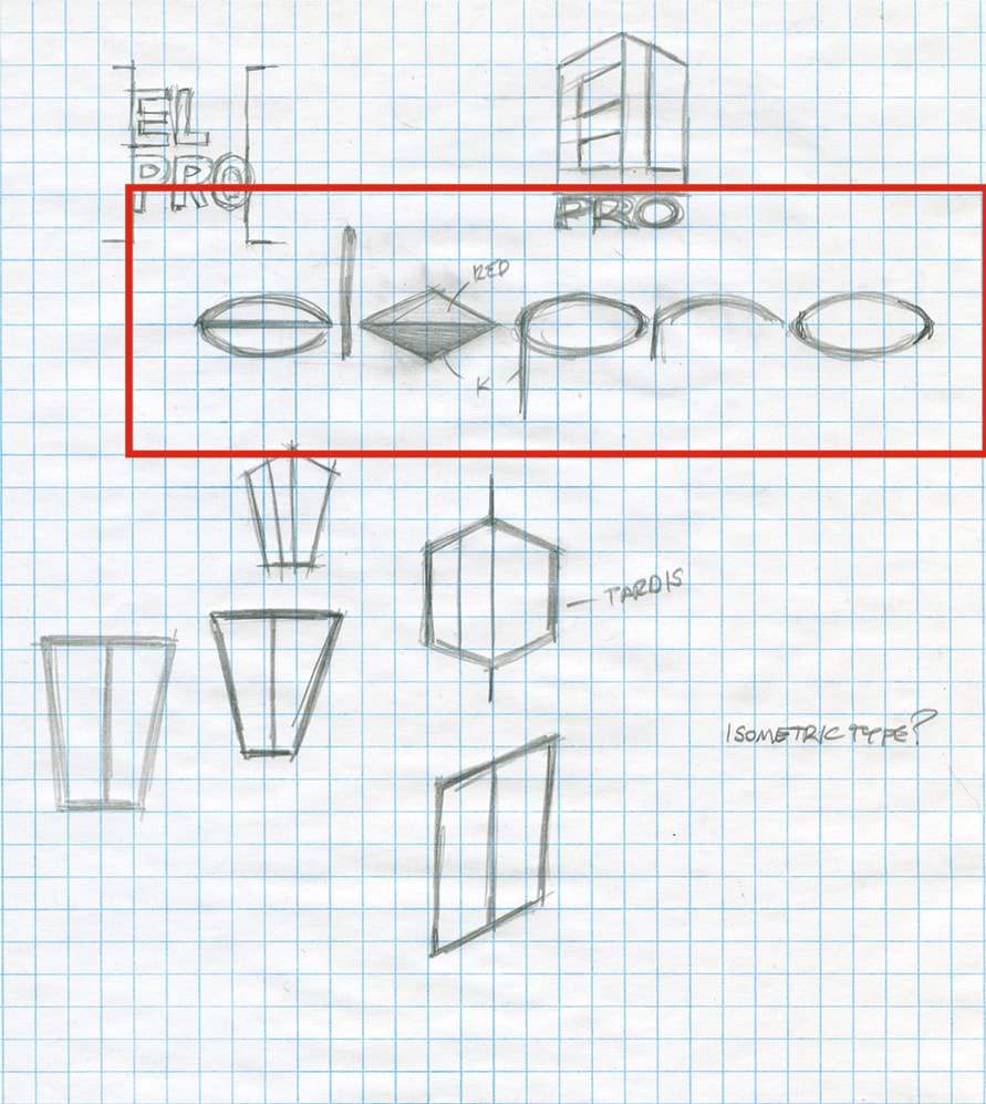
Getting the Ideas Down on Paper
Even though we have computers, iPhones and iPads, we still use pencil and paper around here to iterate initial ideas. Connecting thoughts with a physical medium keeps it real for us. We can also make quick notes, and if we get distracted we don’t have to remember about hitting that Save button. Ideas outlined in red were all taken to the rough construction phase.


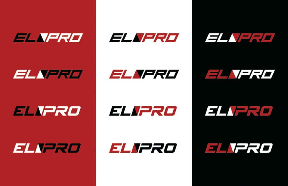
Polishing the Roughs
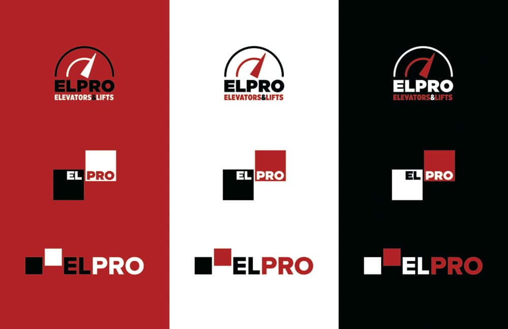
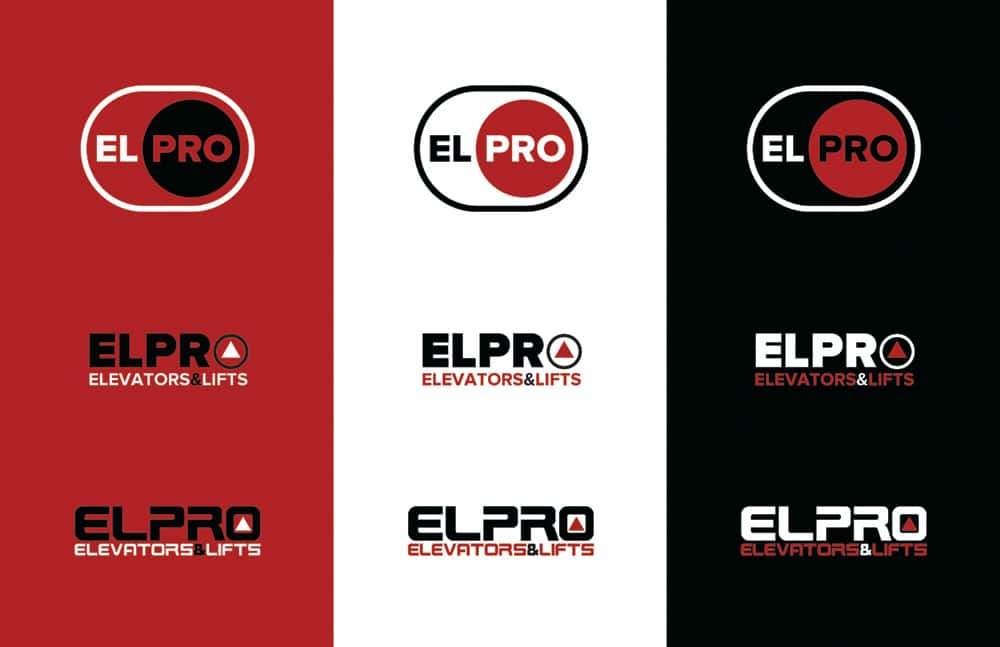
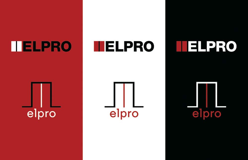
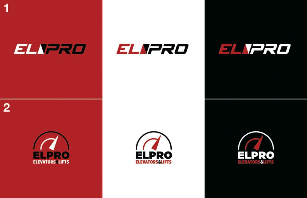
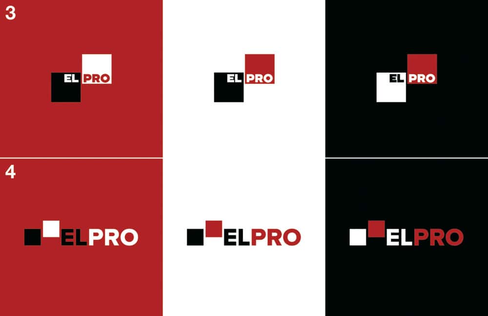
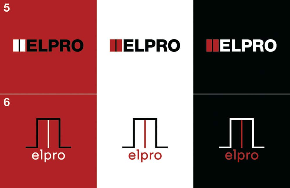
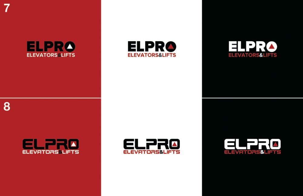
At this point, it’s quicker to translate the initial sketches into digital pieces. Variations can be made in a fraction of the time that hand rendering used to take. As a result, we’re able to give clients more options when the situation allows.
The Final Logo
Would you have made the same choice as the client did?

The Logo Usage Guide
Every brand cop’s shining light that no one else seems to read, but we make it anyways and pray the client follows it. In this age of literally everyone being able to touch the logo – and not just other design professionals – this simple usage document is more important than ever.


ElPro Logo
ElPro knew they needed to update their brand presence to portray themselves as they are – modern and professional, and so it was easy to start the conversation with them about a new logo. We began with competitor research, moved into sketching, and gave them a number of possibilities before reducing and refining to the final solution, complete with logo usage guide.
ClientElpro Elevators & LiftsServicesLogo DesignYear2017Linkelproelevators.com