Complete Services
Branding Language

PSCL has three core areas of operation – distribution, quality and automation. Various custom hardware and software solutions assist customers to produce consistent, high-quality cement products and then get those products into trucks and on the road quickly and efficiently. They reduce wastage and time. They increase security and accountability. They maximize the amount of product that can be moved at each site.
There’s a perception by laypeople that cement is not all that exciting. Like dirt. But it has stood the test of time as one of the main building materials worldwide. And so we never envisioned for ourselves learning this much about the cement management industry, but it was fascinating to develop an understanding of how PSCL created a whole vertical of technology and had it spread across North America and Australia.
That gave us our starting point. This is high technology. Custom creation. Chemistry management. Automation engineering.
That puts them in a space with Siemens, GE and others – the Apples of the industrial world.
For graphic elements we kept things simple and spare – basic colours and icons for the three segments. When we presented the different offerings in those segments, we created labels inspired by the periodic table of elements to keep everything consistent line-wide and to make future additions systematic to add. And it echoed the precision in what they did.
Content Generation
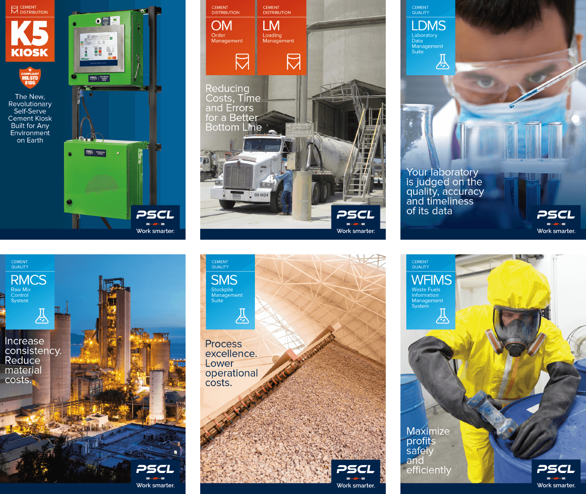
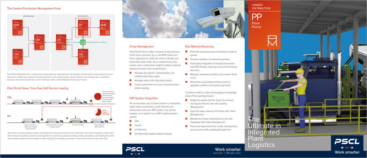
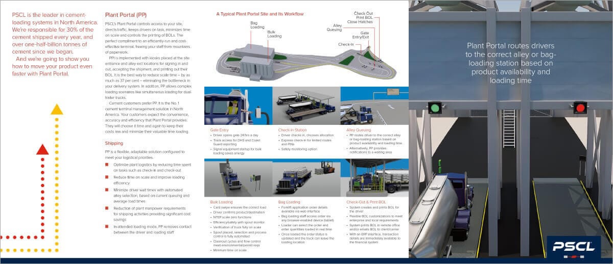
We created brochures to be printed and eventually made downloadable on the site. Internal subject-matter experts are vital to success at this stage, and PSCL stepped up providing rough copy we then edited for length, an approachable and conversational tone, and consistent voice across the entire line.
PSCL already had many good photos – often a challenge for companies not used to sustained marketing efforts – but we knew we’d need more. We brought in a photographer and directed them through multiple sessions, and will continue to do this as needed. We put a human face to the work with the photography – teamwork, service, dedication, and so on. Solutions backed by responsible people there to serve the customers’ needs. It gives us the opportunities we need to tell the whole of PSCL’s story.
Hardware and software will change, but if you know a team of bright, motivated people are there to change with you, it develops confidence in the company overall.
We finished this phase with the printed pieces in hand, and a clear idea of the core content for the website.
Website
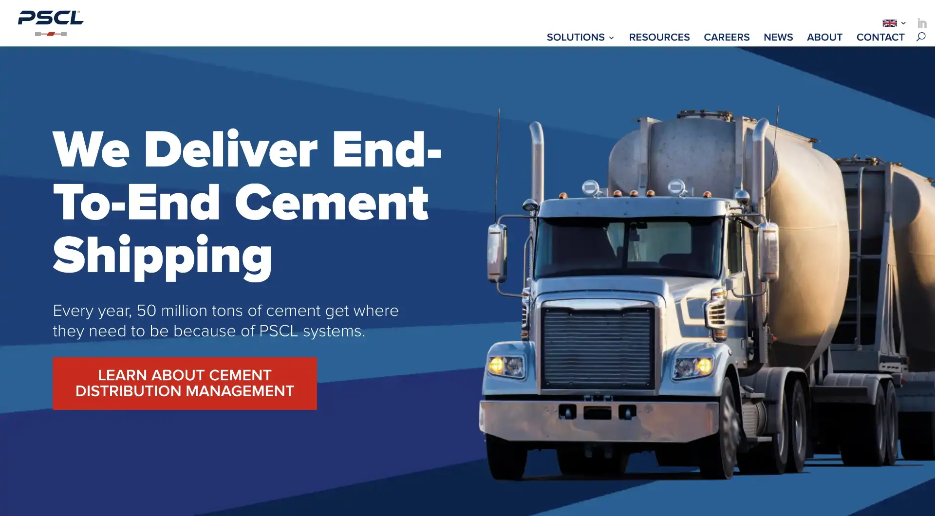
Because we’d done the brand and content development in the right order – before the website design – executing this part of the communication plan rollout was very straighforward and without significant rework.
We had a deadline for the site to be launched in time for a tradeshow, and that meant we would only have the basics done – what’s often called the minimum viable product (MVP). But PSCL understood what we had to say: a website is not a print item. It is an ever-evolving thing and as long as we keep making progress, keep making those wheels turn, we make sure it’s a living document that grows and becomes more comprehensive. A good strategy for many companies is that websites should be iterative and not attempt to be definitive right out of the gate.
We’re now on the second version of the home page. A few years down the road and PSCL is in a different place. Their market penetration is good, so going into more details and offering more access points into new content we’ve added over time has been a good next step. It’s also a longer page with more animations. Scrolling is no barrier now, and with more powerful mobile devices customers like more interactivity.
Advertising




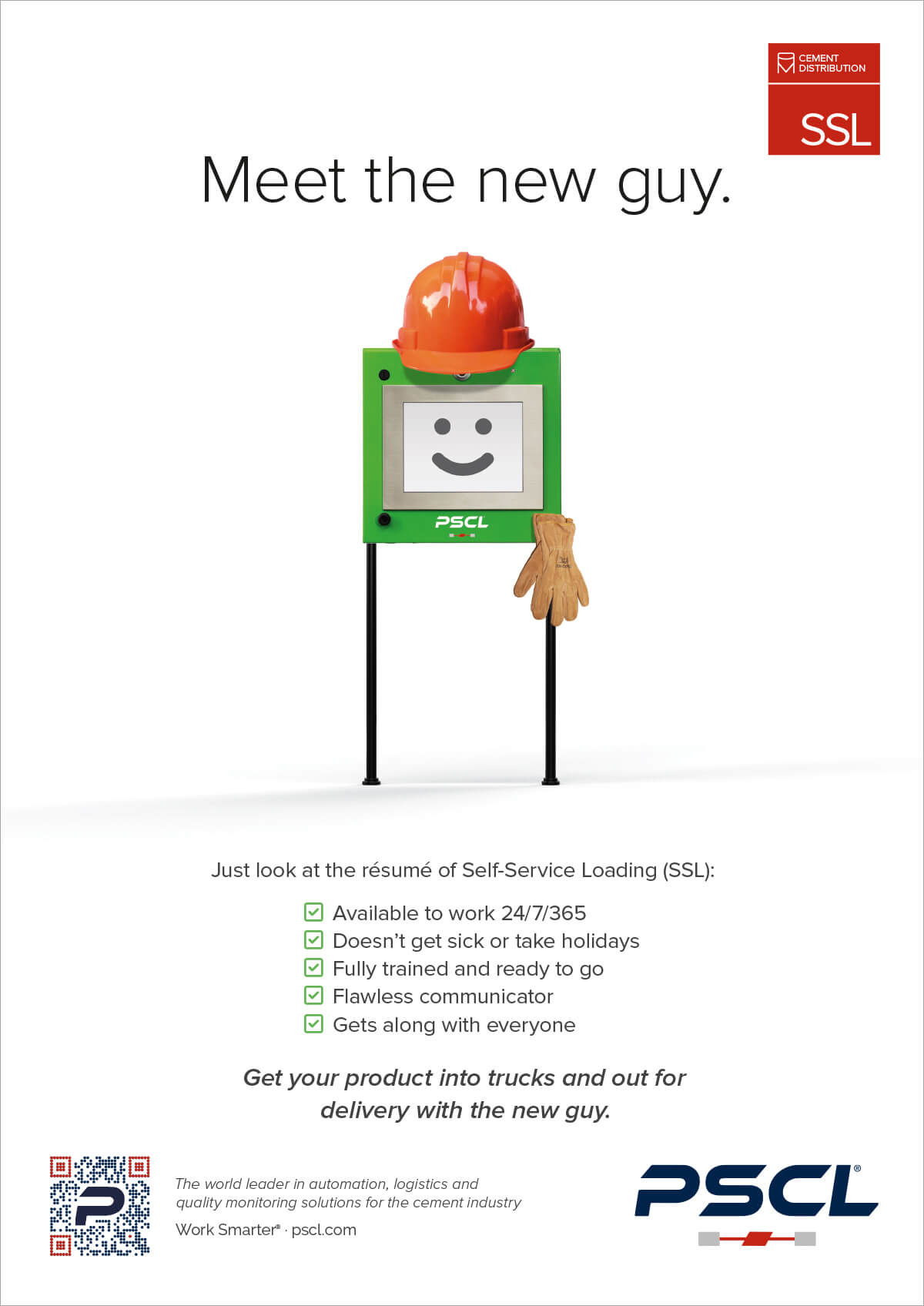
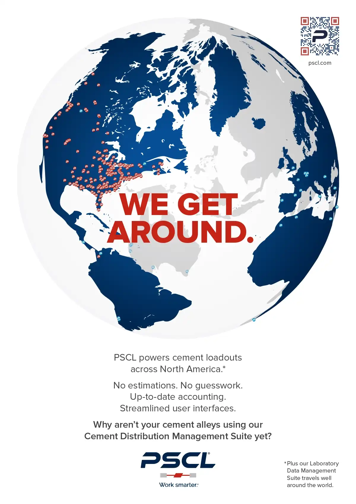
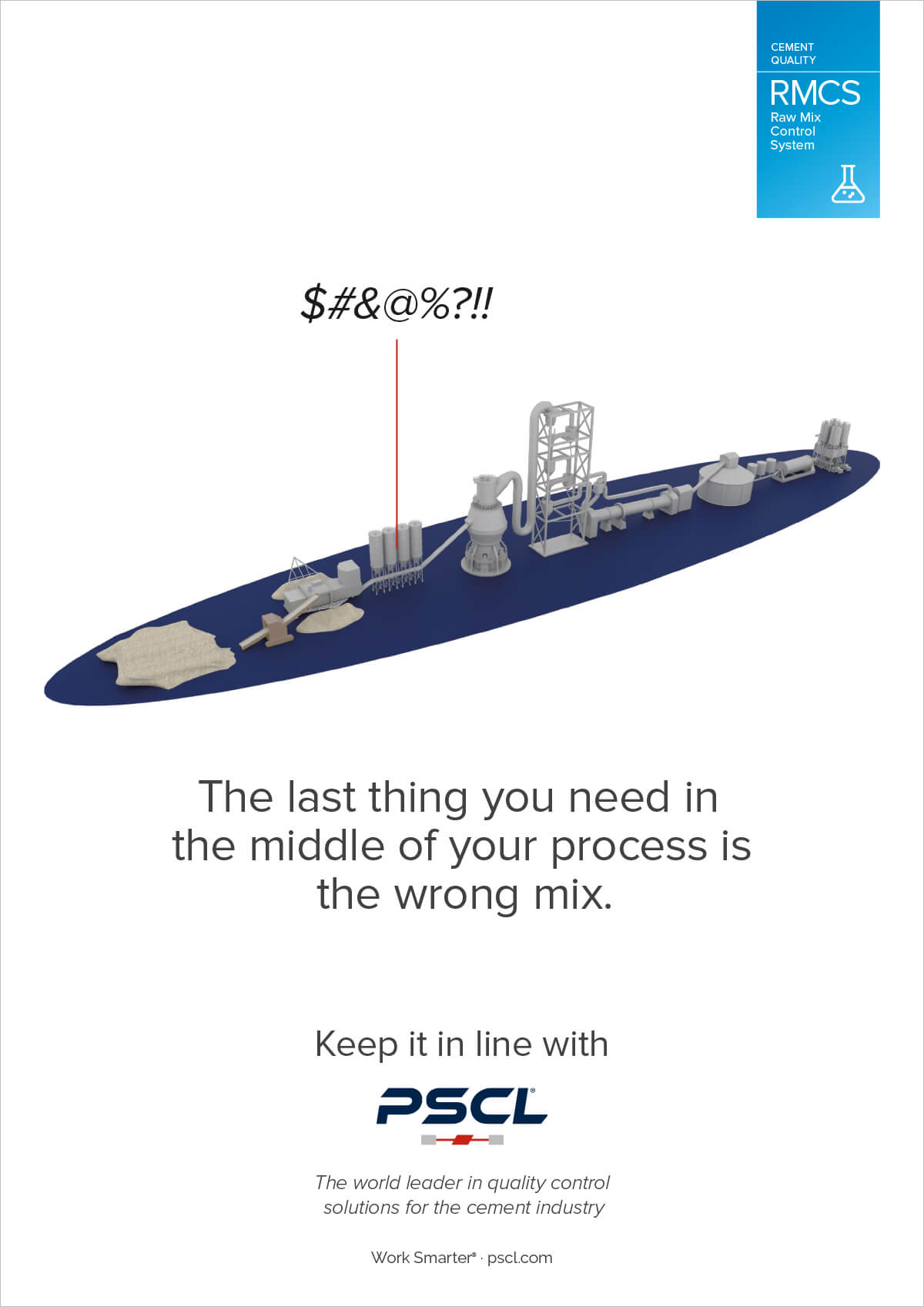
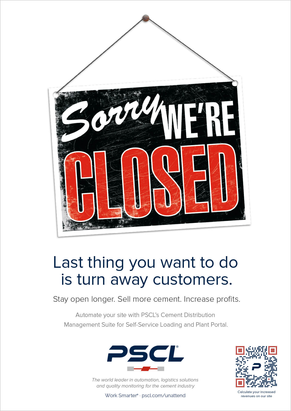
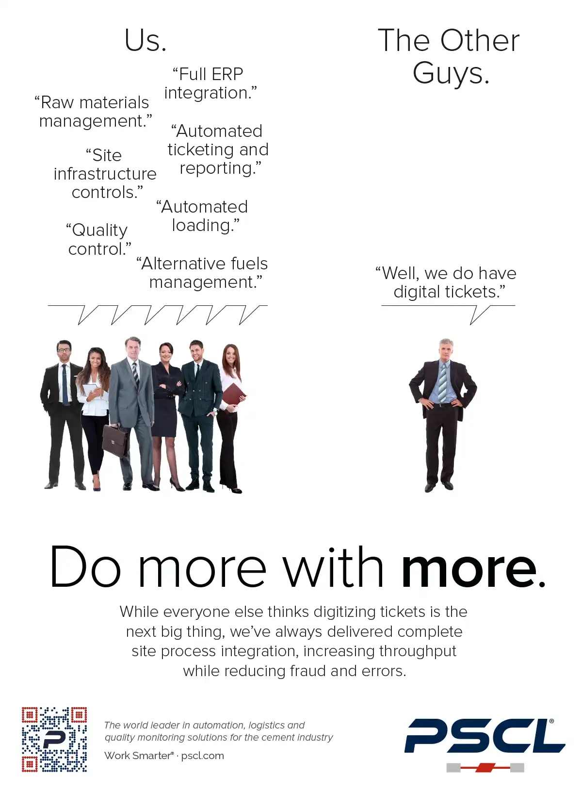
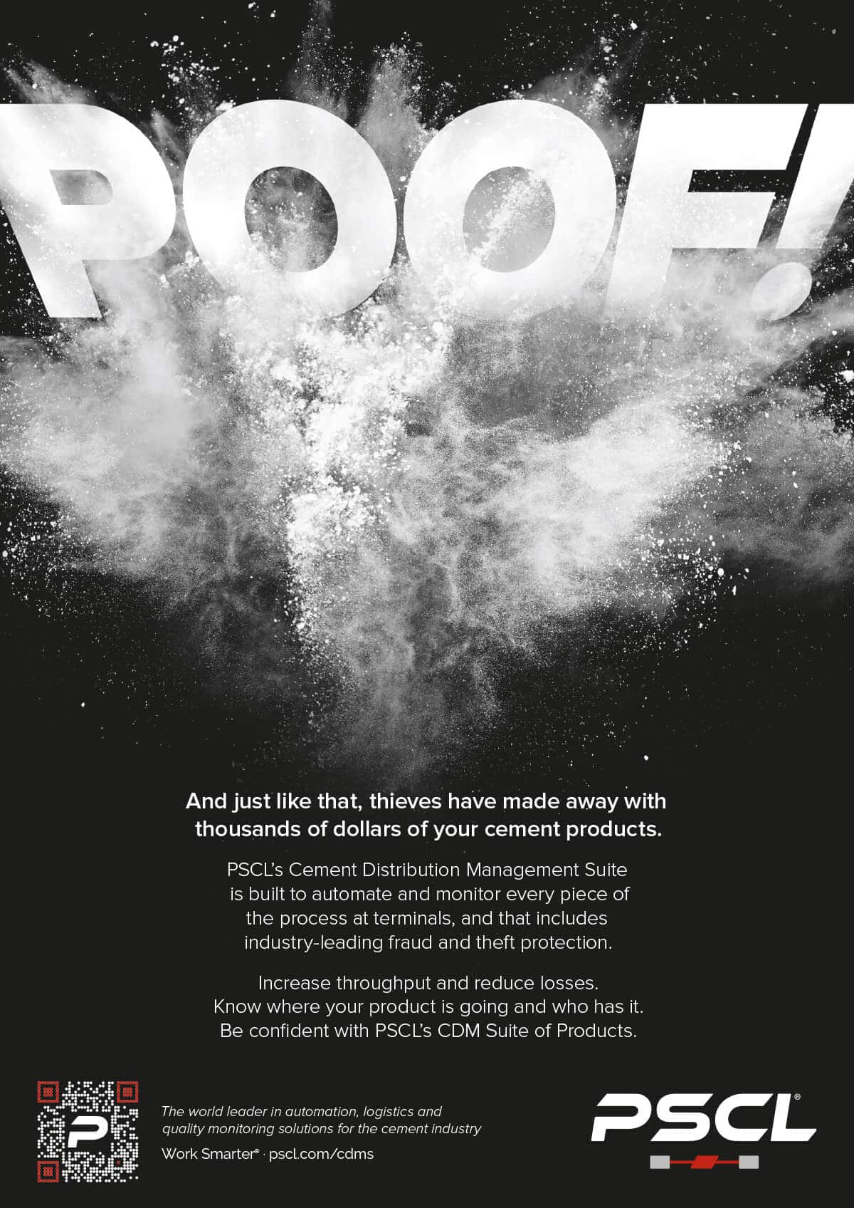
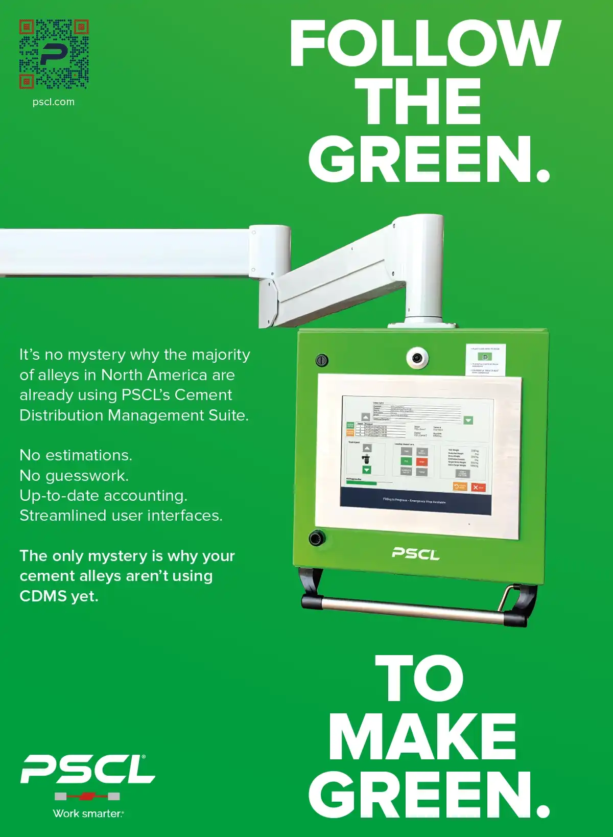
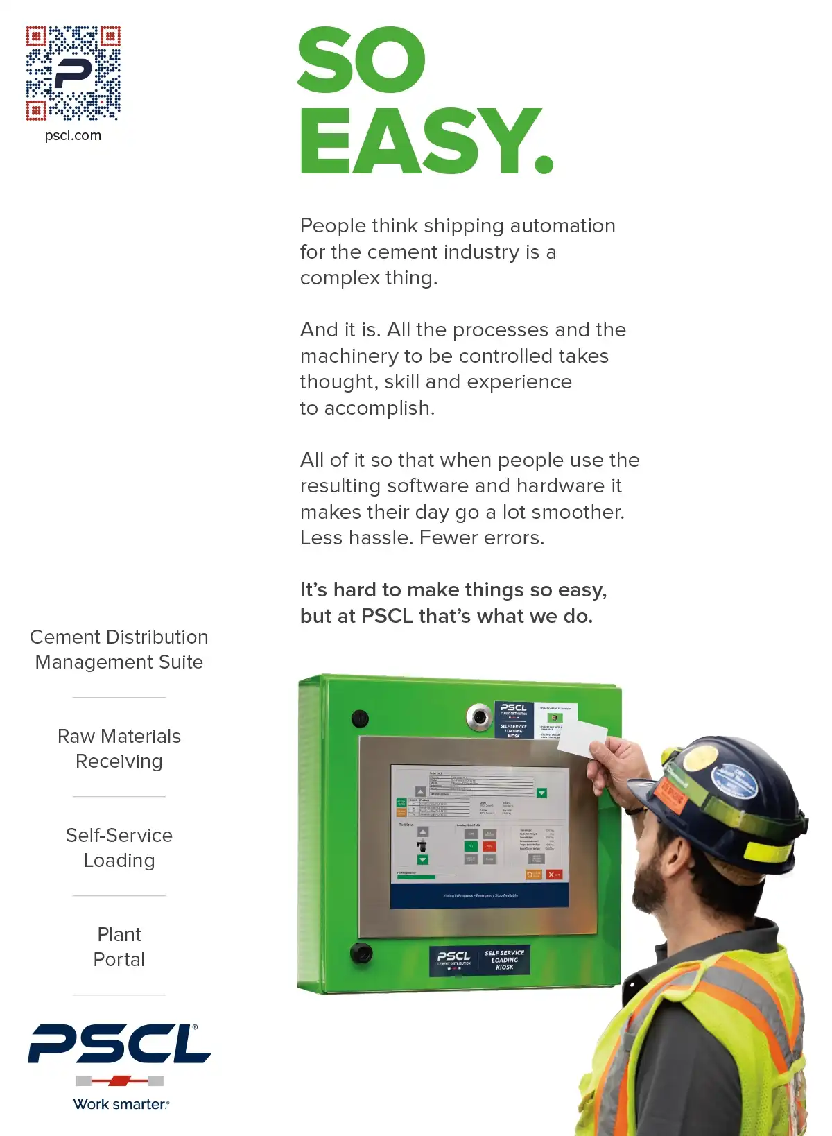
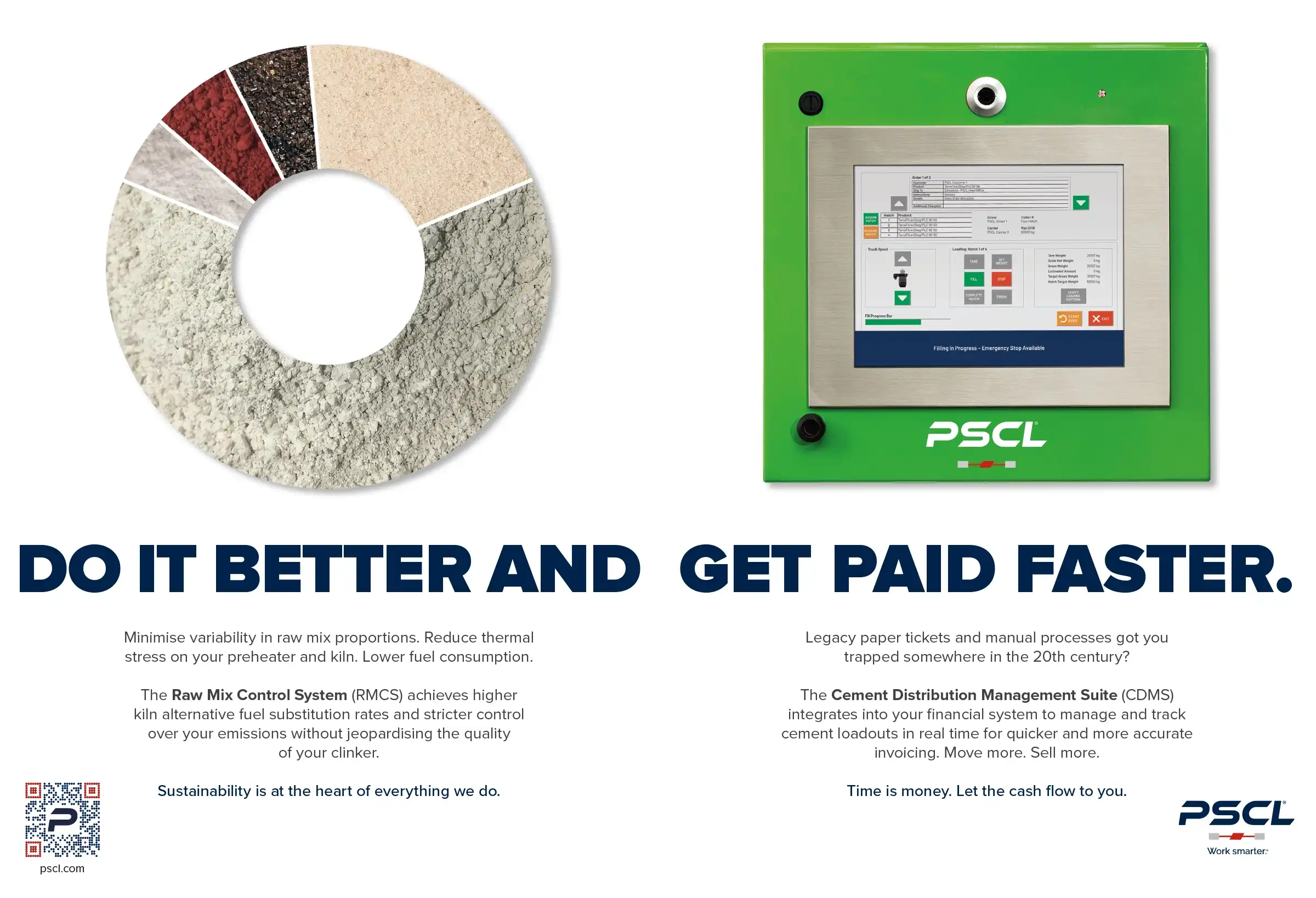
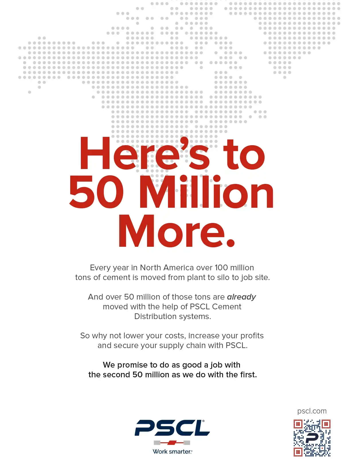
In addition to regular maintenance and updates to the website, Infinity Reef provides advertising creative direction, copywriting and design services, working hand in hand with PSCL to define what they need to get out there and how we can frame that in the overall story that is PSCL and its brand.
PSCL understood that a brand is built by placing the first bricks in your communications foundation correctly. They didn’t jump ahead or focus on the mere æsthetics. As a result, we were able to build a logical and coherent storytelling framework with them, one that is flexible and compelling, standing out as a leader in their marketplace.
Tradeshow Booth
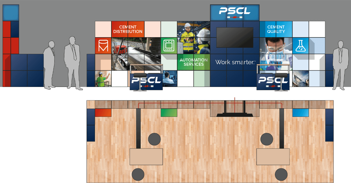
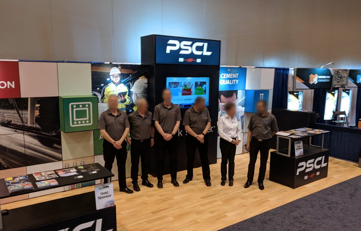
We’ve used ExpoDisplay’s MultiQuad system before. In a time where messages need to be constantly updated or tweaked for different audiences, its modular approach with swappable tiles is perfect. Lightweight to move and robust once assembled, it gives a powerful presence on a tradeshow floor when design complements the benefits it provides.
For the IEEE-IAS/PCA Cement Conference we did a booth themed around the rebranding with the new core elements front and centre. And it was very well received by the cement community, drawing in people who knew PSCL from years past and for whom it was a new experience. They definitely got the message this was an exciting new era for PSCL. And beyond that, a former customer was impressed at the new energy and messaging conveyed by PSCL and their booth and a six-figure deal was closed, more than covering the costs of the new booth and the expense to be at the tradeshow.
Beyond having a solid, basic booth, they have something which can be added to over time like LEGO®. For example, they go to a show that is primarily about cement quality, you use that segment and add new tiles to fill the rest – or only use a portion of the booth if it’s a smaller space. They enjoy lower overall costs because they’re not carrying large amounts of redundant hardware.
Interior Graphics
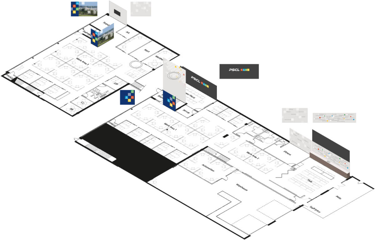
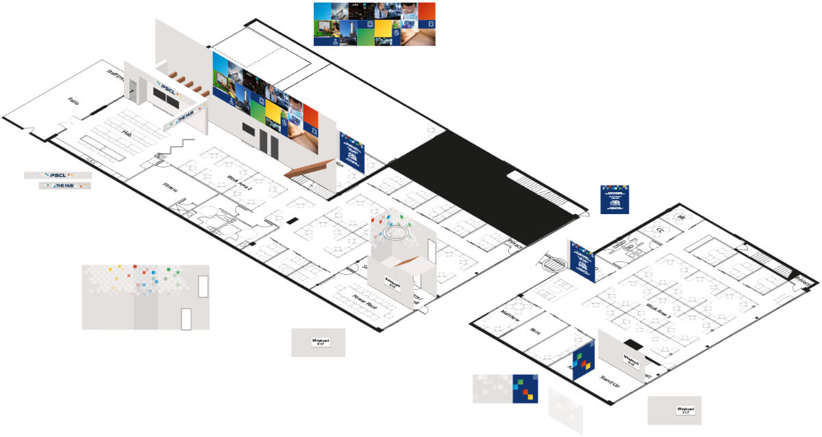
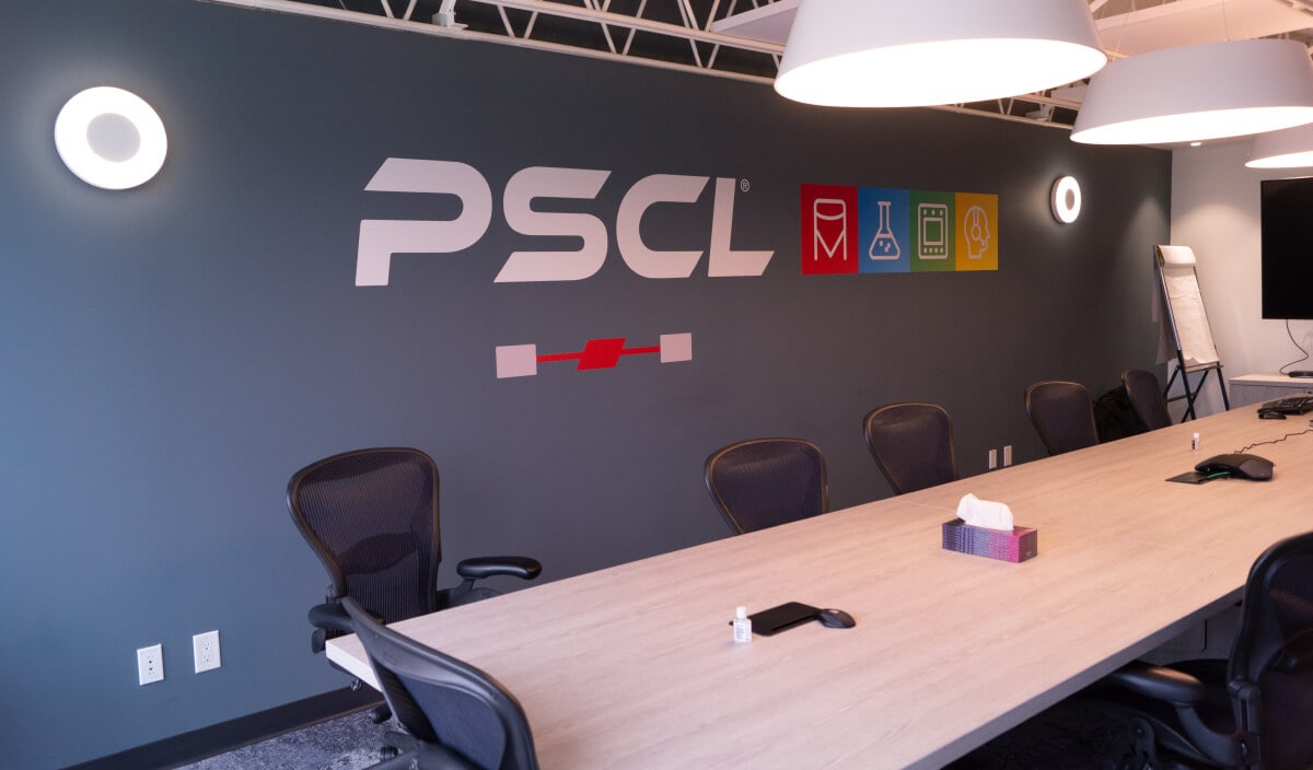
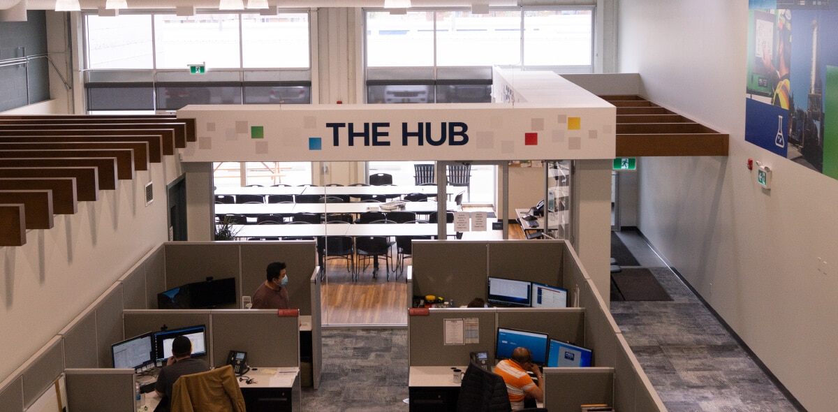
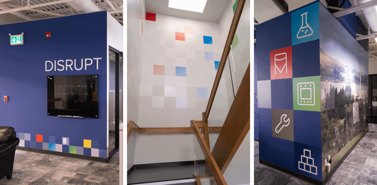
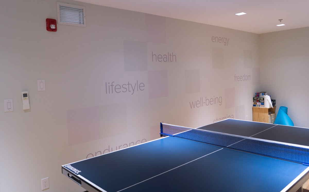
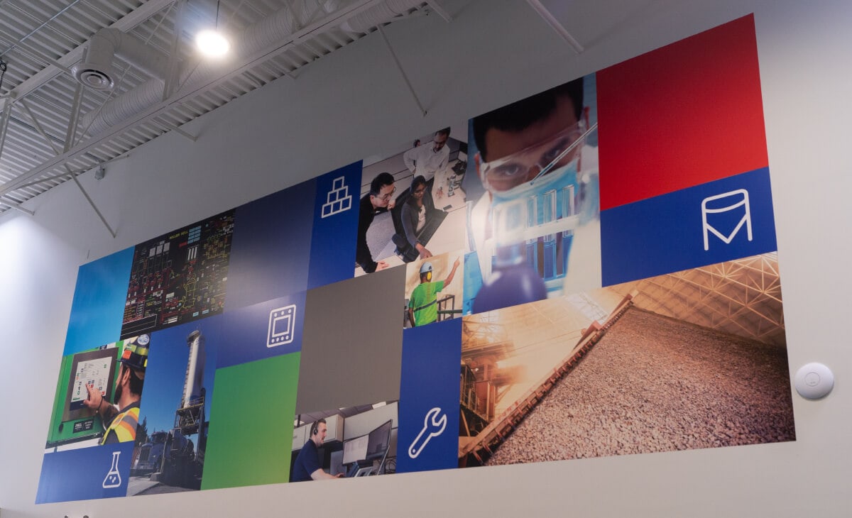
Having moved into newly-renovated offices, PSCL wanted to brand a number of spaces that are largely public facing. Starting with a floorplan, we created an isometric mockup of the interior. Adapting the design language first used in the tradeshow display, we extended the module metaphor to be more decorative. We also added different coatings to various squares, using gloss, matte and textured laminates to catch the light in interesting ways as people moved past the graphics.
PSCL
Process Solutions Canada Ltd. had already started taking steps to modernize their brand. Now known as PSCL, a change in ownership infused a tremendous amount of energy and the will to move forward, setting higher standards in all aspects of the company.
This included marketing. A new logo was developed inhouse and a tagline created – Work Smarter™.
We were brought in to further develop their brand character and to rebuild their communications presence from the ground up. As with many industrial companies, the focus in the past had been solely on what they created. In this case, it was software and hardware to manage distribution, quality and automation in the production of cement. After initial meetings with the management team and key players to establish where they had been and where they wanted to go, we went away to put some thought to it.
Two things were apparent to us from the outset:
One, while they knew what their core areas were, they hadn’t been able to segment and unify those areas of operation into a coherent story; and
Two, you can’t easily differentiate widgets in the marketplace. We would need to put a human face to the company to illustrate the change in the company.
ClientPSCLServicesFull Marketing ServicesYear2019–PresentLinkpscl.com
